Insta-worthy
photography
Insta-worthy
photography
Insta-worthy
photography

Nature's Way
Art Direction
Art Direction
Context:
Nature's Way is a natural vitamin company with 50+ years of experience in the health and nutrition space.
The Challenge:
Nature's Way needs to establish better brand awareness as online vitamin subscriptions are becoming more popular, and drug store generic brands are getting more shelf space.
The Solution:
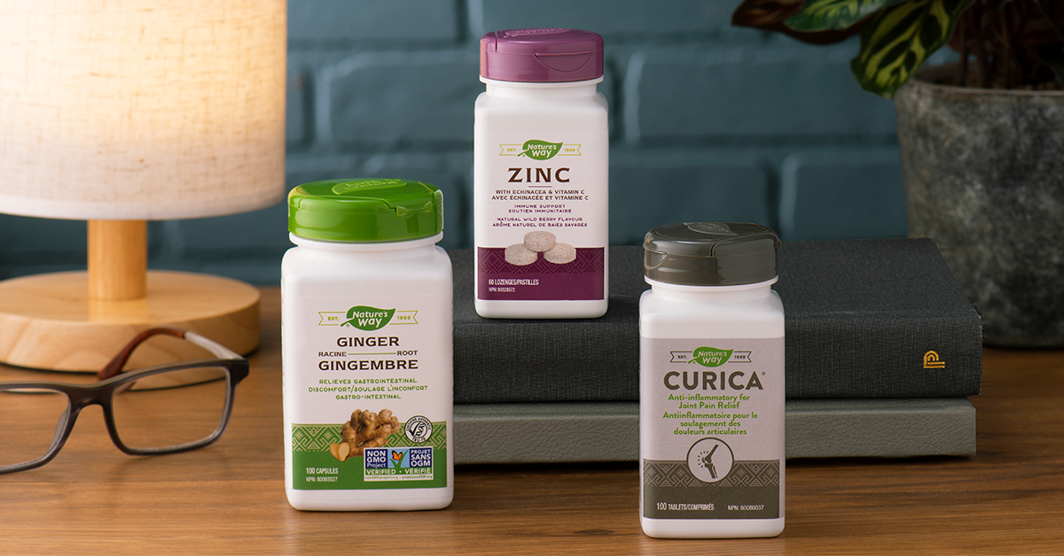
We proposed increasing their social presence with two new Instagram accounts. I've levelled up the brand with custom photography each quarter, which translate quality and trust in the brand.


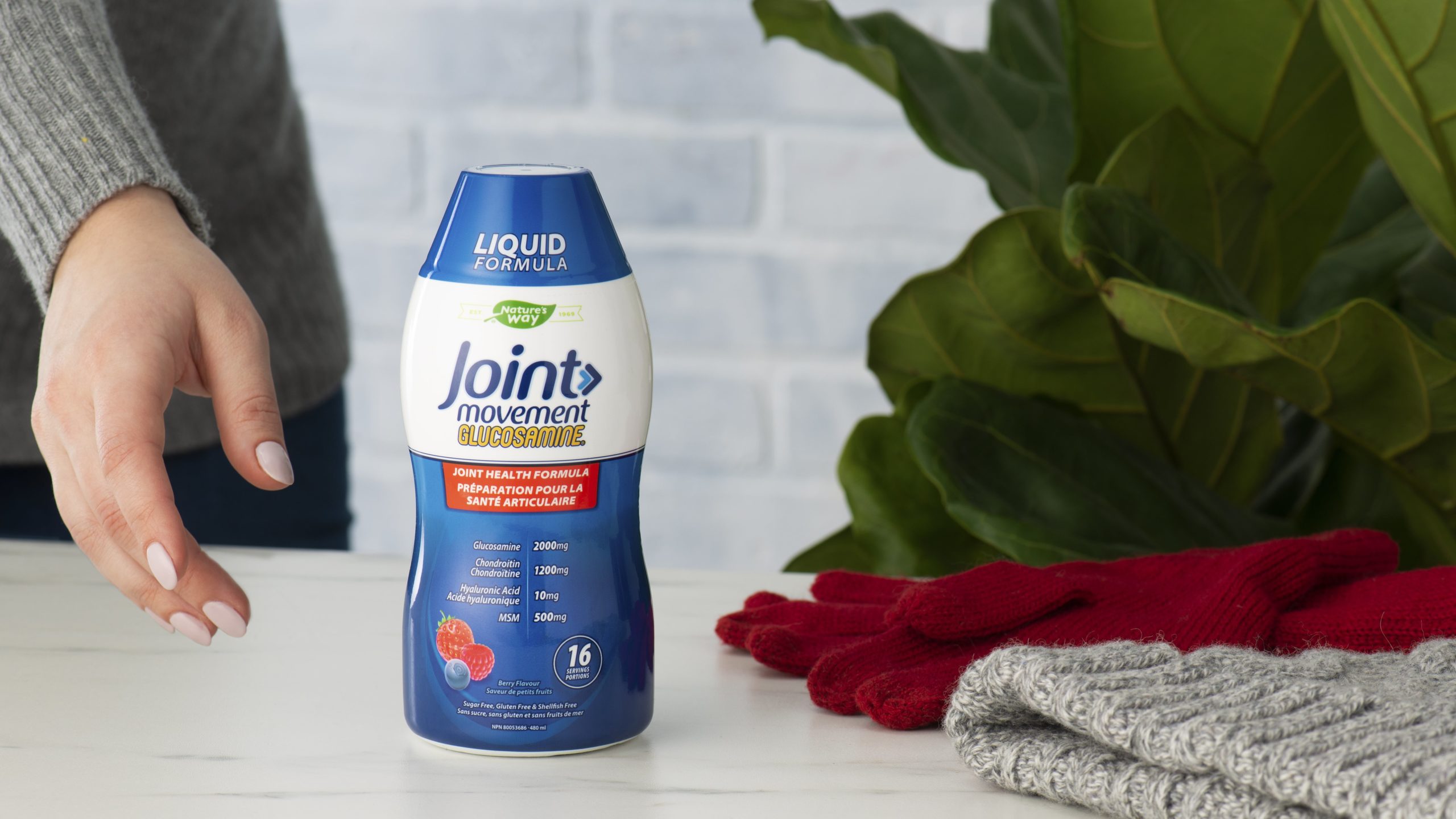
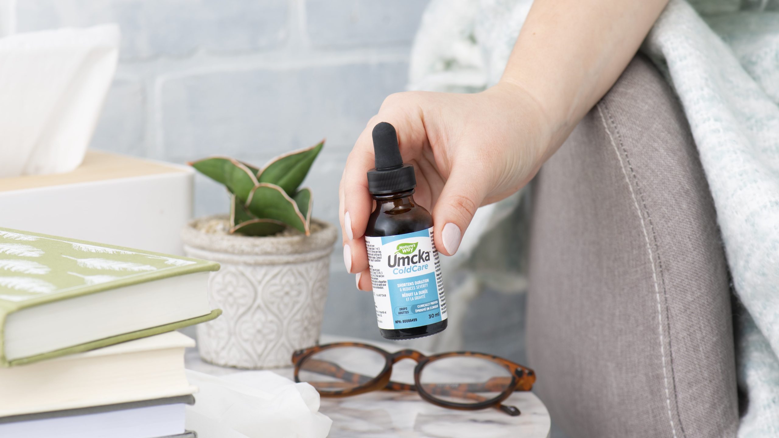
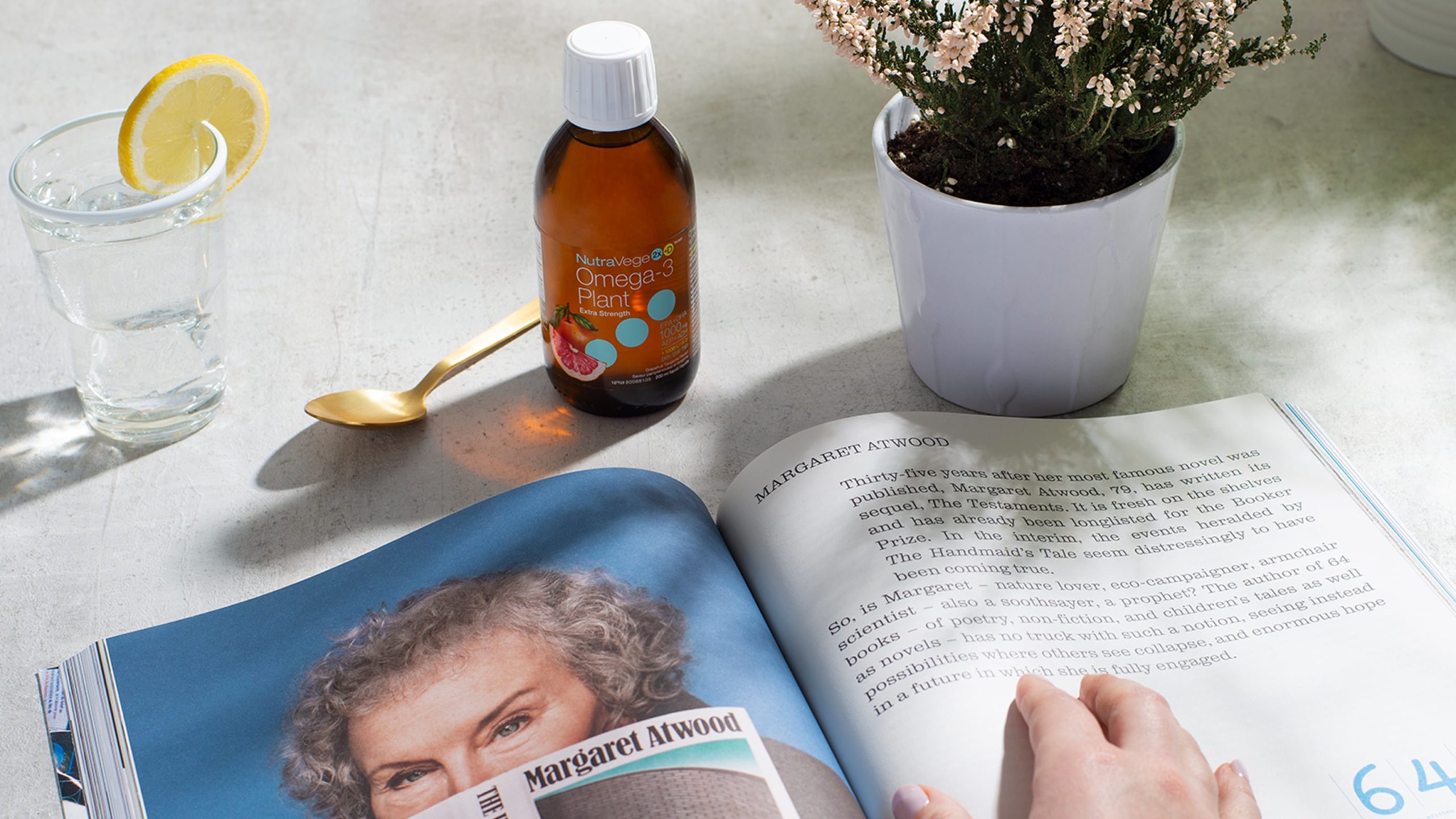
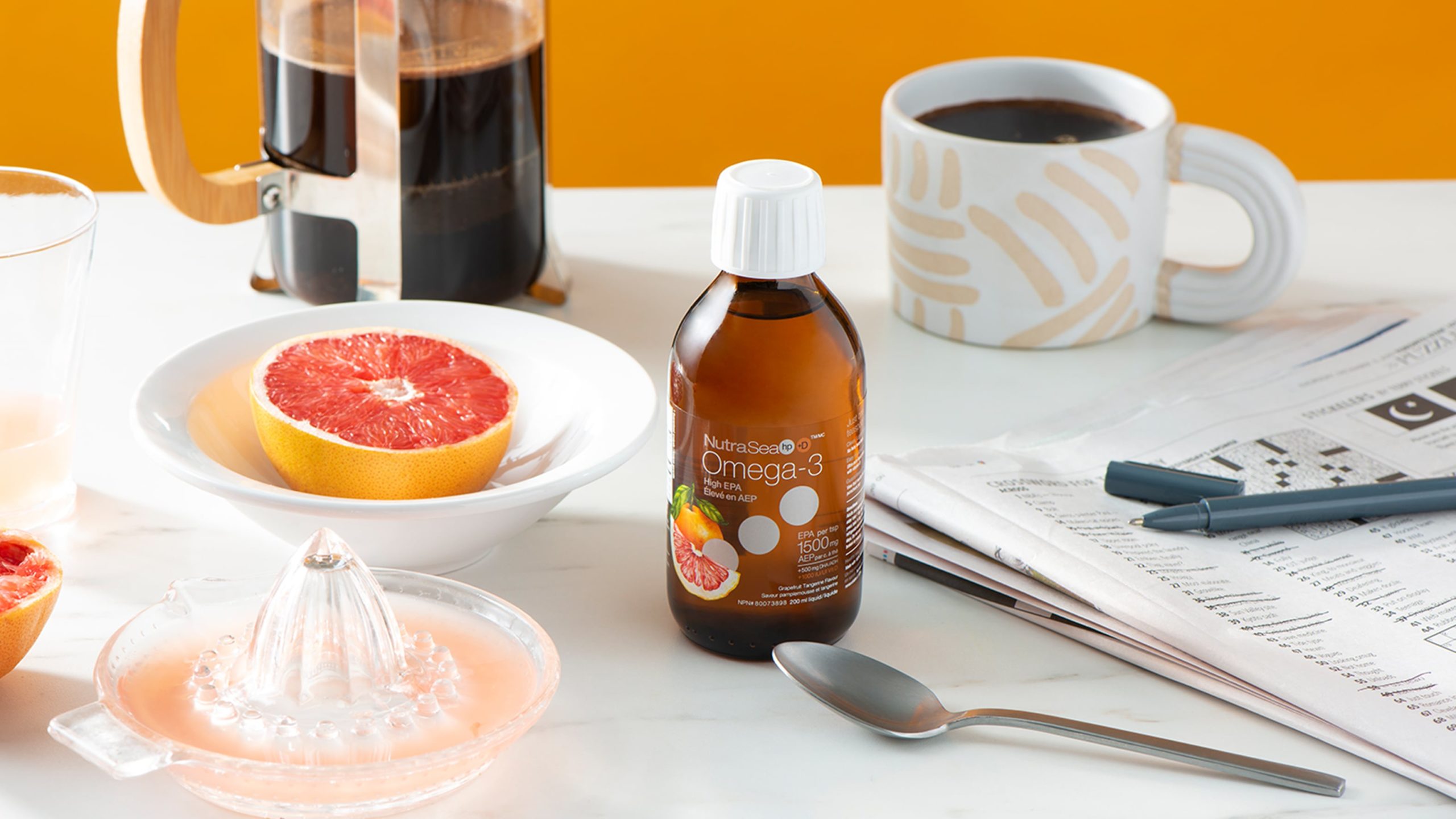
To create a more lifestyle aesthetic, I brought in the use of directional lighting, realistic backgrounds with warm tones, and the use of hand models, all to create a more lifestyle look.


After
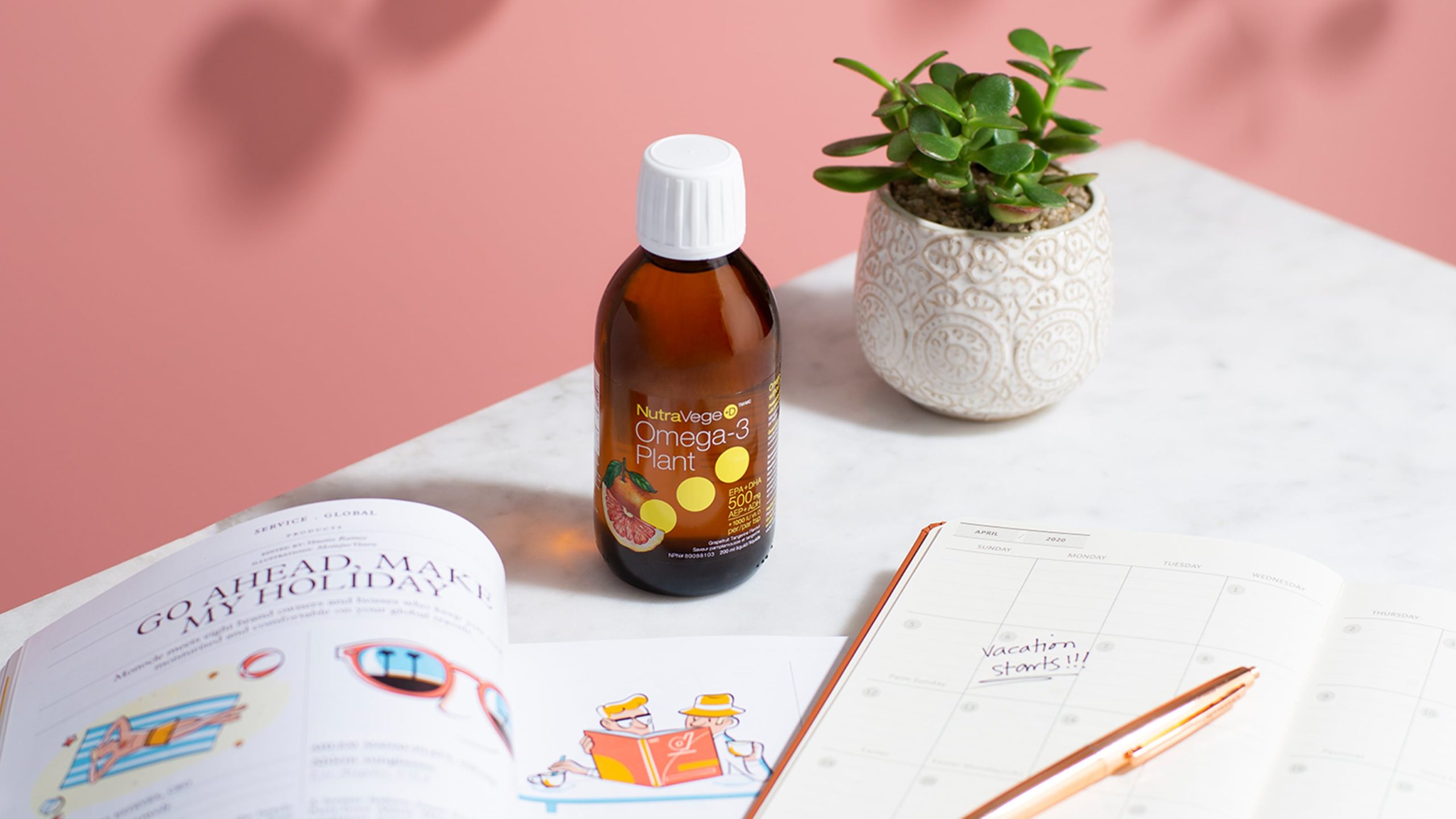
NutraSea

To utilize the gorgeous amber bottles, I introduced directional lighting to the shoots so we could get more depth. We also always use bright coloured backgrounds and warm light to make the product stand out.
To utilize the gorgeous amber bottles, I introduced directional lighting to the shoots so we could get more depth. We also always use bright coloured backgrounds and warm light to make the product stand out.
To utilize the gorgeous amber bottles, I introduced directional lighting to the shoots so we could get more depth. We also always use bright coloured backgrounds and warm light to make the product stand out.


Results
Both channels have seen an immense change in the quality of imagery, making both brands stand out in the crowded health/vitamin sector. As of now, we've quadrupled their followers and have grown engagement with the brand. This has prompted Nature's Way to invest in better content each quarter and to continue to grow our photoshoot budgets.
My Role
Art Direction
The team
Creative Lead - Julie Martinson & Cian Noland
Photographers/Studio - The Hot Plate
Writer - Maria Powers
*
*
*
Some projects are under passwords due to legal things
- please reach out and I'd love to share it with you.
Some projects are under passwords due to legal things
- please reach out and I'd love to share it with you.
Some projects are under passwords due to legal things - please reach out and I'd love to share it with you.
Thanks for visiting my site! If you want to reach me feel free to contact me via email or creep me on social. We can chat about design opportunities... or we can gossip about the lastest RuPaul episode 
Thanks for visiting my site! If you want to reach me feel free to contact me via email or creep me on social. We can chat about design opportunities... or we can gossip about the lastest RuPaul episode
Thanks for visiting my site! If you want to reach me feel free to contact me via email or creep me on social. We can chat about design opportunities... or we can gossip about the lastest RuPaul episode
Contact Me LinkedIn Insta